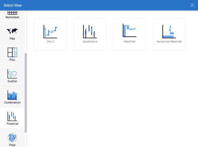
Types
Nectari offers a vast choice of graphics to display data.
The Type Selector from the Settings menu
makes it easy to toggle between the different types of graphics to choose the desired representation of the
data .
Not all the graphics represent the data accurately, therefore it is important to choose the appropriate graphic depending on the type of data.
The View Type Selector is organized in categories. These are the types available:
Worksheets: the most common way of presenting data.
Bar, Line, Pie, Scatter, Financial, Polar, Radar: these graph types are used to display and compare data visually. Available choices include: Bar (horizontal or vertical), Range Bar, Bullet Graph, Lines/Area, Spline/Area, Step Line/Area, Pie/Donut, Funnel, Scatter, Bubble, Polar, Radar, Financial’s (Candlestick, Waterfall).
Misc: this category contains Gauges, Tree Map, Sparkline graph type and Word Cloud.
- Gauges and KPIs are mostly used for indicators on dashboards, as they are very limited in the amount of data they can display.
- Sparklines also display only one series of data, such as one information over time
Map: in this section there are several world and country maps available. Countries currently available: USA, Canada, UK, India, Argentina, Australia, Austria, Belgium, China, Colombia, Denmark, France, Germany, Italy, Netherlands, New Zealand, Norway, Poland, Portugal, Russia, South Africa, South Korea, Spain, Sweden, Switzerland, Thailand and Venezuela.
